Category:
Product Design
Role:
UX/UI Design, Graphic Design


My Approach
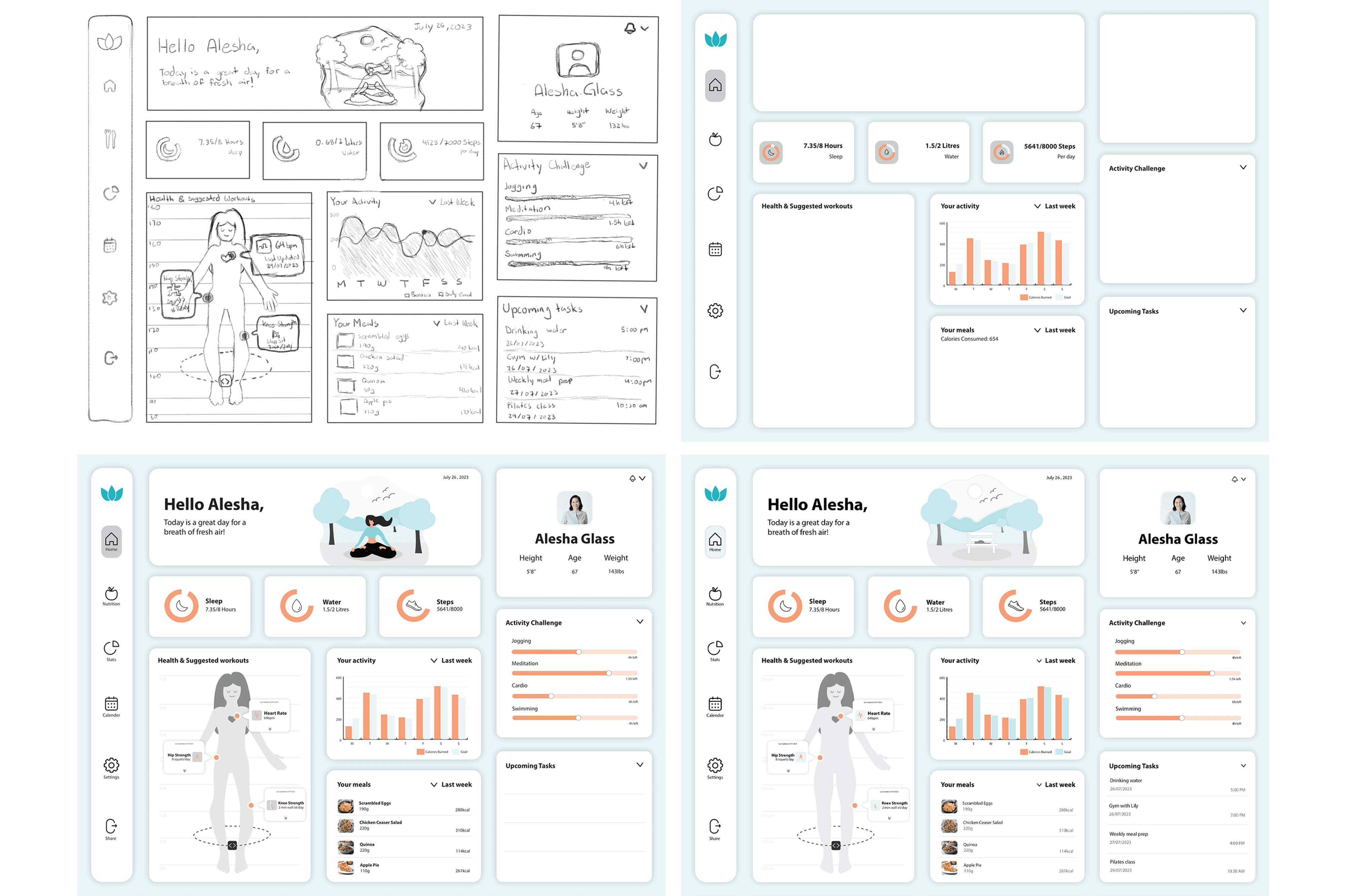
Introducing an interactive analytical dashboard designed to transform complex datasets into clear, actionable insights. By combining visualizations, intuitive filters, and a user-friendly interface, the system helps users quickly understand trends and make confident decisions. Beginning with hand-drawn wireframes and evolving through multiple refined iterations, the dashboard was shaped around clarity, balance, and meaningful storytelling. This project reinforced the power of data-driven design — showing how thoughtful visualization and intentional layout can bridge the gap between information and action.
Vision and Innovation
My vision was to merge functionality and calm design — creating a dashboard that users enjoy returning to. I wanted the interface to feel friendly and structured, using soft colours, rounded components, and tonal illustration to reduce cognitive load. The innovation came from treating the UI like a “daily wellbeing landscape,” where charts, cards, and metrics work together to guide the user rather than distract them.
Identifying Unique Challenges
Through iterative drafts, several challenges emerged:
The dashboard contained a large amount of data (sleep, water, steps, meals, workouts, activity graphs, tasks). Presenting all of it without clutter was crucial.
The sidebar navigation needed to remain recognizable and readable at a glance — early drafts lacked clarity and label consistency.
Charts and cards needed to visually relate to one another while still allowing quick scanning.
The “Health & Suggested Workouts” section required a way to communicate body metrics on a simplified human figure without overwhelming detail.
Resolving Complex Problems
I refined the layout through multiple iterations — adjusting spacing, increasing contrast, standardizing headings, and optimizing card distribution.
The circular metric cards (Sleep, Water, Steps) were enlarged and given consistent labeling to improve readability.
The activity bar chart was redesigned with clearer colour separation and a toggle for comparing calories burned vs. weekly goals.
“Health & Suggested Workouts” was restructured so each update appears as a floating label on the human figure, giving it personality without clutter.
The task list was simplified and realigned to keep the focus on upcoming behaviours, not past actions.
These refinements resulted in an interface that feels balanced, clean, and truly informative.
User-Centric Design
User experience guided every decision:
The dashboard opens with a friendly greeting, a calming illustration, and the current date — anchoring the user before presenting data.
Key daily metrics are prioritized at the top, following natural left-to-right scanning patterns.
Colour coding (peach vs teal) helps users quickly differentiate between current values and goals in charts.
The sidebar uses simple icons and generous white space for quick recognition.
All elements use consistent rounded geometry, reinforcing a supportive, approachable tone.
Detailed Pages and Features
The final dashboard includes several core components:
Daily Metric Cards Sleep, Water, and Steps visualized with circular progress indicators.
Personal Profile Summary User info (age, height, weight) surfaced for context.
Activity Chart A weekly bar graph comparing calories burned vs. goals.
Activity Challenge: Progress bars for jogging, meditation, cardio, and swimming.
Meals Overview List of meals with portion size and calories.
Health & Suggested Workouts Interactive human silhouette with dynamic metrics.
Upcoming Tasks A clean schedule of reminders for workouts, hydration, and classes.
Accessibility and Optimization
I designed the dashboard with accessibility in mind:
High colour contrast for all text and key data points
Large tap/click targets for cards and toggle areas
Consistent iconography in the sidebar
Clear labeling on charts and values
A soft palette for low cognitive stress and long-term use
The final interface is visually calming yet data-rich — supporting both everyday quick checks and deeper weekly reflection.
Conclusion
This project strengthened my understanding of how to structure complex data in an intuitive, human-centred way. By combining thoughtful layout planning, multiple rounds of iteration, and a balance of charts, cards, and illustrations, the analytical dashboard delivers meaningful insights at a glance. The final design feels approachable, optimistic, and supportive — helping users stay engaged with their daily habits and overall wellbeing.

